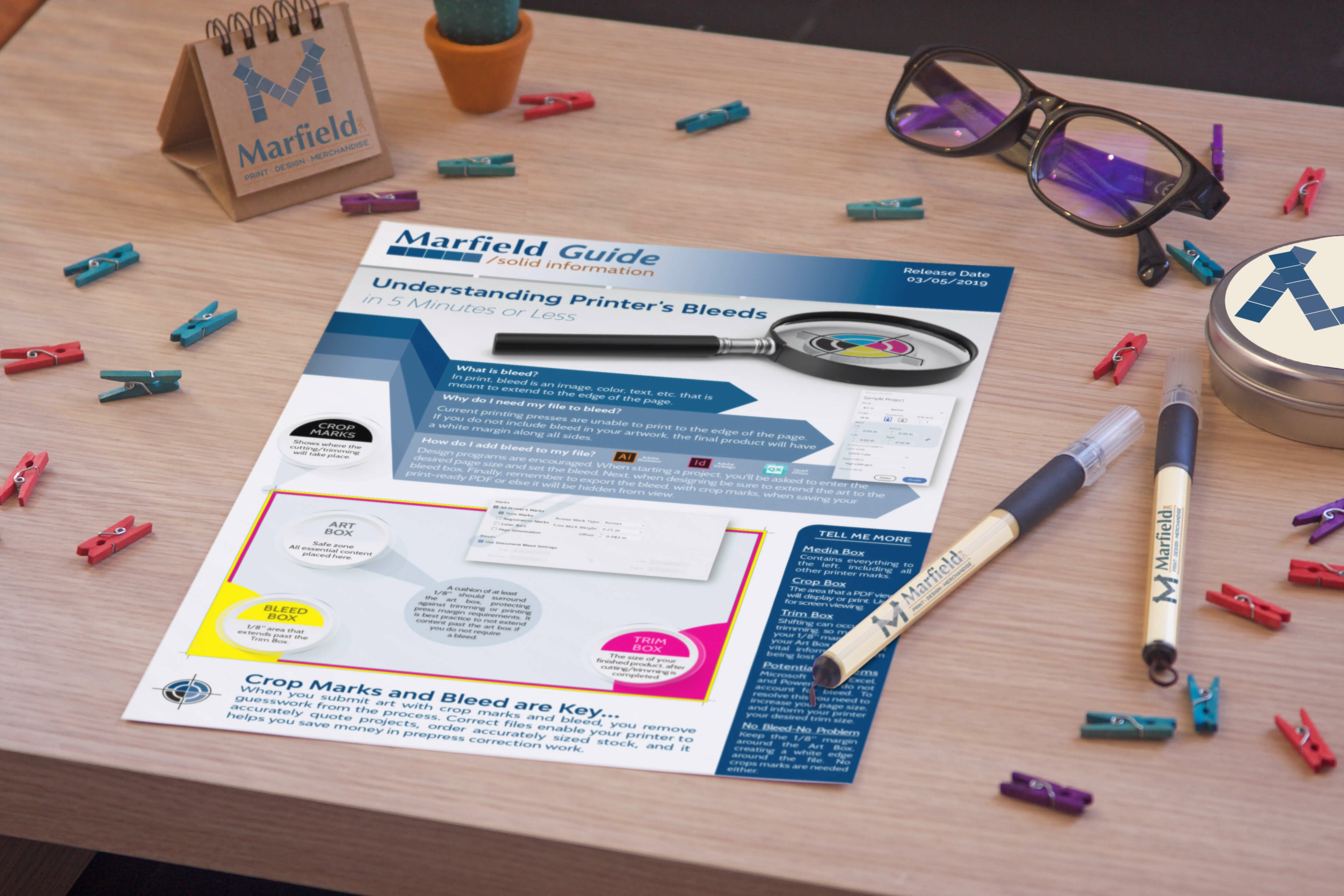
Understanding Printer’s Bleeds in 5 Minutes or Less
When I began my career in printing I was fresh out of college with an Art Degree, and eager to put it to use. After being hired at a local printer, I was quickly moved to the prepress department, and the rest is history!
Well, not exactly…I was assigned my first design job for an internal marketing event, and I was told my art wasn’t print ready. They further explained that my file needed bleeds, and full disclosure, I had no clue what they were asking for. This is when I had an “ah-ha” moment…In school, we learned computer programs, color theory, and design principles, but we never learned prepress!
If “print-ready” artwork isn’t really print-ready, what good is it? When you have incorrect art, you’ll either increase your cost by having the prepress department fix it or even worse, your artwork will be printed as is and your final product will not be what you envisioned. Fortunately, I had two marvelous mentors (thank you, Brian and Rob) who taught me the trade which provided the skill set needed to succeed in this field, and now I’m sharing it with you!
So today, let’s discuss the importance of bleeds and crop marks when submitting artwork for print. Now, if you’re already wondering, “what’s that?” don’t worry! By the end of this article, you’ll know the difference between the Art Box, Crop Box, Trim Box, and Bleed Box. Your printer might even be saddened when they can’t charge you an art fee to correct your files in the future!
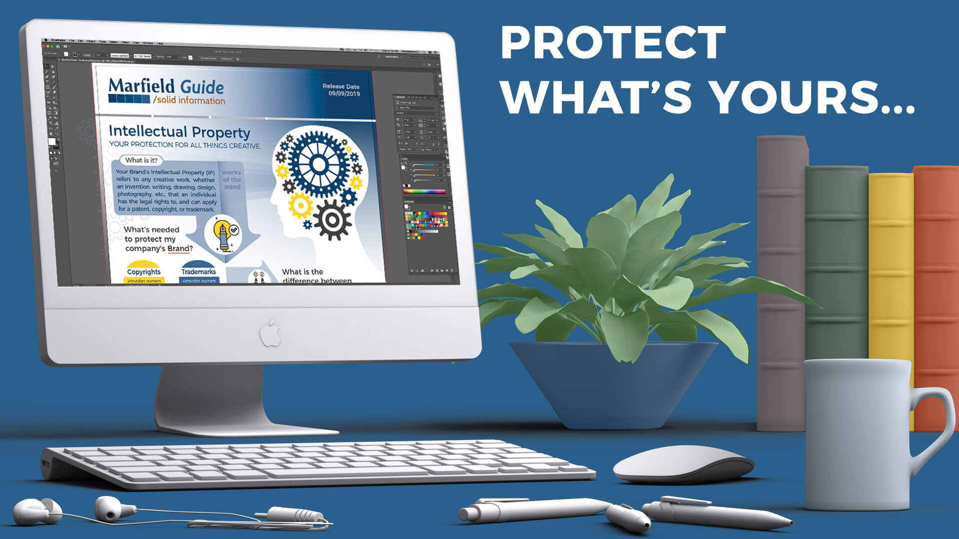
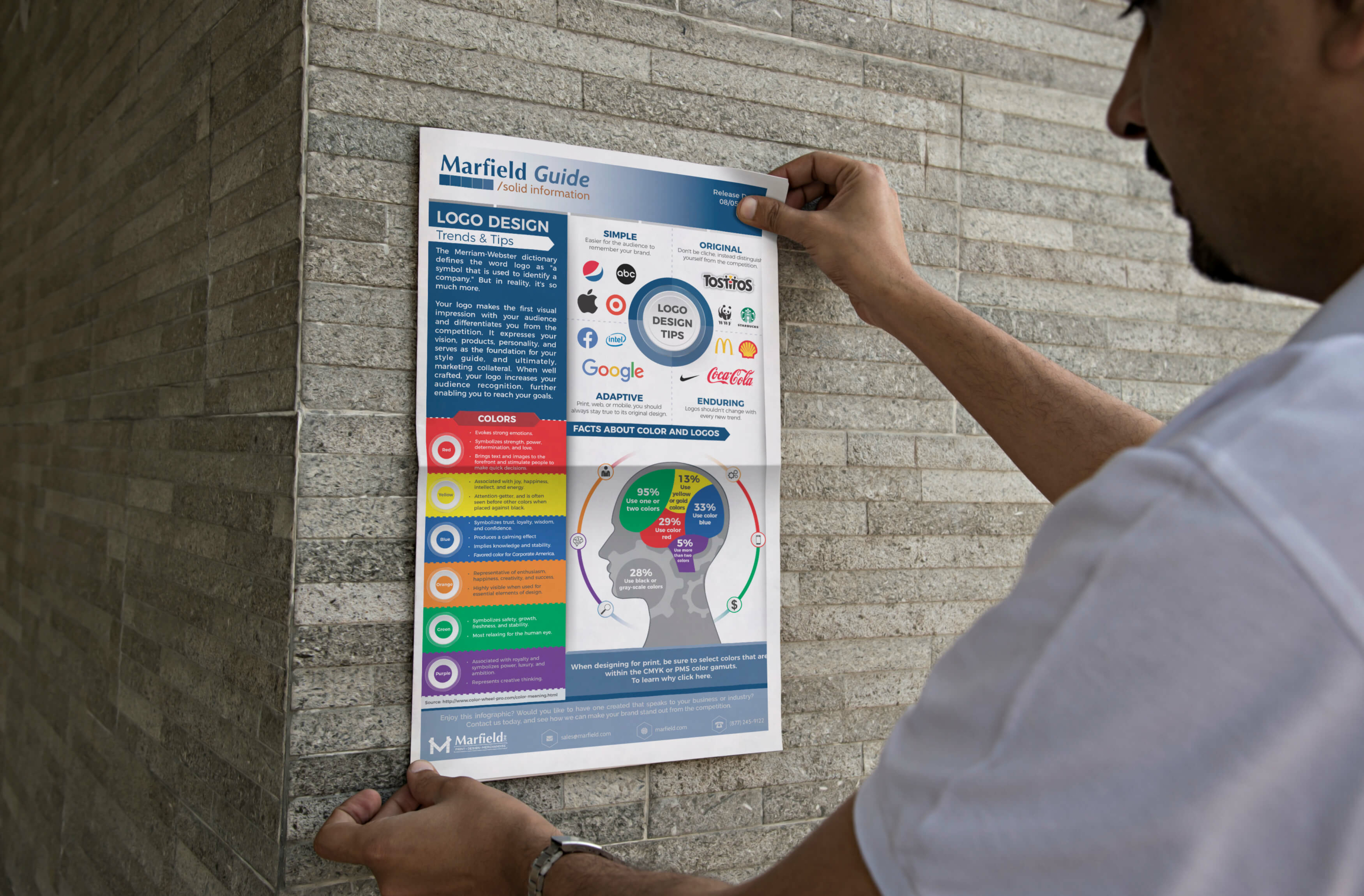
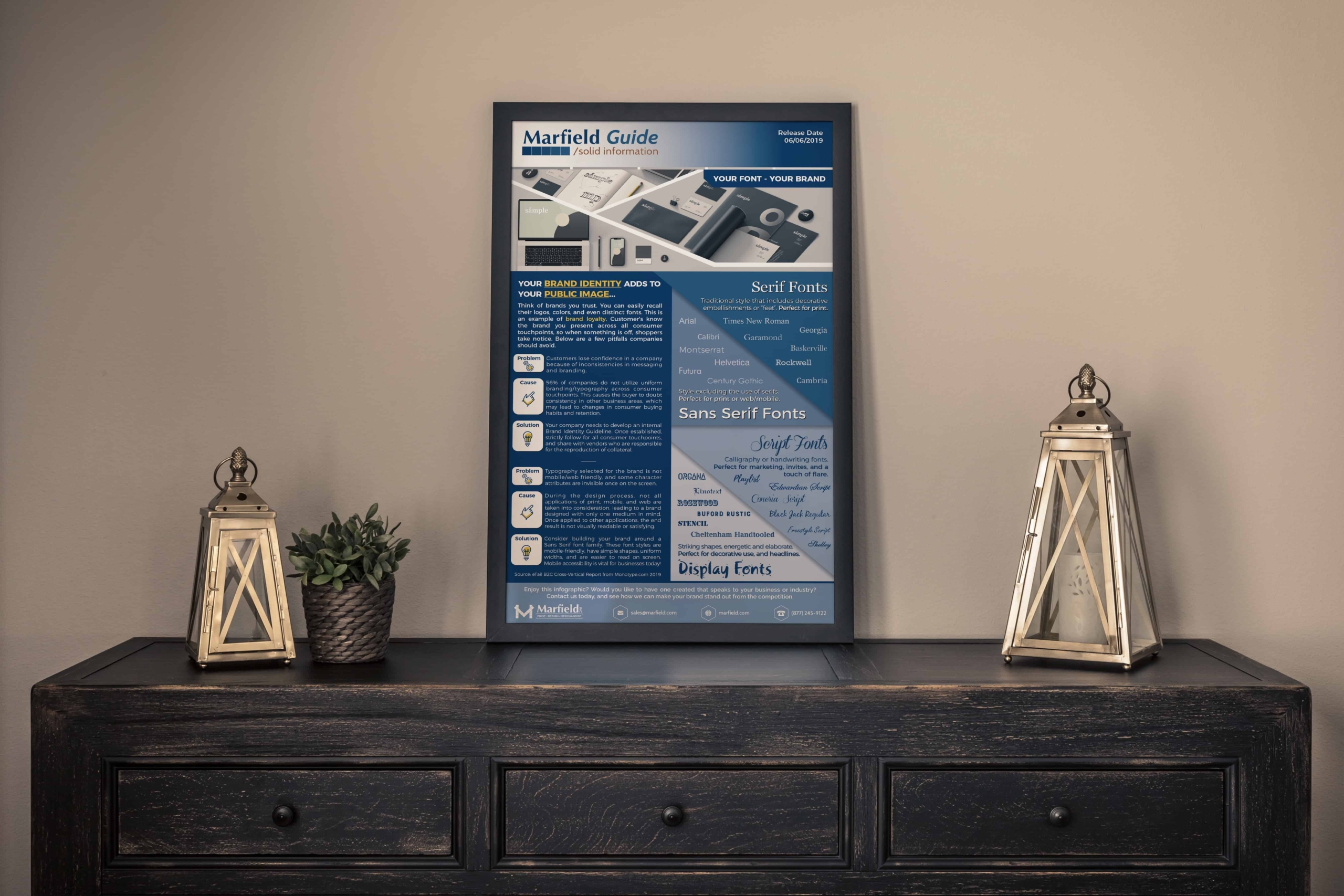
To download a full resolution copy of this infographic, click here.
Thank you for reading our article, and don’t forget to check out future blog posts. Next month we’ll discuss preparing your files for print, or in the prepress world known as preflight. Do you have questions about this article, a horror story of a job gone awry, or a topic you want to learn more about? Comment below and let your voice be heard!
Tiffany Waggoner is the Creative Director for Marfield, Inc. In 2003, Tiffany graduated from The University of North Texas with a B.A. in Art, specializing in Digital Media. After a quick moment of panic...wondering what to do with an Arts Degree...she soon found her home and career in Print and never looked back!
Ten years ago, Marfield, Inc. took a chance on a young prepress professional and hired Tiffany to run their Prepress Department. During this tenure, Marfield's customers could trust her as their brand identity expert, and she honed her craft as a graphic designer. In 2018 Marfield took another venture and moved Tiffany into the role of Creative Director. In this position, Tiffany has been able to combine her knowledge of content creation, social media, brand identity design, and creative print to engage and educate Marfield's audience on all things print.


Leave A Comment
You must be logged in to post a comment.